

Static to Story-Driven: A Stone Martin Builders Website Redesign
Led end-to-end UX research, strategy, and design for Stone Martin Builders’ award-winning website redesign, transforming an information-heavy site into a guided, human-centered experience that helps buyers confidently discover, compare, and book tours for their future homes.
Led end-to-end UX research, strategy, and design for Stone Martin Builders’ award-winning website redesign, transforming an information-heavy site into a guided, human-centered experience that helps buyers confidently discover, compare, and book tours for their future homes.
Led end-to-end UX research, strategy, and design for Stone Martin Builders’ award-winning website redesign, transforming an information-heavy site into a guided, human-centered experience that helps buyers confidently discover, compare, and book tours for their future homes.


Project
End-to-End Strategic Website Re-Design
Industry
Regional Homebuilder
Users
Homebuyers exploring new builds, and current homeowners seeking resources
Role
Lead (& Sole) UX Researcher and UX Designer
Timeline
11 months (May 2024 – March 2025)
LIVE WEBSITE
The Challenge
Stone Martin Builders came to us with an existing website that was no longer meeting their business or user needs. While the site provided information, it lacked a human touch. Users could find details, but not clarity, making it difficult to understand which homes were available, where they were located, or how to take the next step.
The Goal
Create a warm, high-touch digital experience that mirrors the concierge-style care of the in-person sales process, helping users feel confident, supported, and inspired as they search for a new home.
My Role
End-to-End UX Research: Executed a comprehensive research strategy involving user and stakeholder interviews alongside a competitive landscape analysis to identify core market opportunities.
Strategic Synthesis: Translated complex qualitative data into actionable design artifacts, including 4 distinct personas, customer journey maps, key user flows, and an affinity-mapped feature prioritization matrix.
UX Design & Prototyping: Owned the full UX design lifecycle, producing 20+ responsive wireframe templates for a 100+ page ecosystem and developing high-fidelity prototypes for iterative usability testing.
TEAM
UX Research, UX Design, UI Design, FE Engineering, BE Engineering, Copywriter, Project Manager
Project
End-to-End Strategic Website Re-Design
Industry
Regional Homebuilder
Users
Homebuyers exploring new builds, and current homeowners seeking resources
TEAM
UX Research, UX Design, UI Design, FE Engineering, BE Engineering, Copywriter, Project Manager
tools
Figma, FigJam, UserTesting.com
Timeline
11 months (May 2024 – March 2025)
LIVE WEBSITE
The Challenge
Stone Martin Builders came to us with an existing website that was no longer meeting their business or user needs. While the site provided information, it lacked a human touch. Users could find details, but not clarity, making it difficult to understand which homes were available, where they were located, or how to take the next step.
The Goal
Create a warm, high-touch digital experience that mirrors the concierge-style care of the in-person sales process, helping users feel confident, supported, and inspired as they search for a new home.
My Role
End-to-End UX Research: Executed a comprehensive research strategy involving user and stakeholder interviews alongside a competitive landscape analysis to identify core market opportunities.
Strategic Synthesis: Translated complex qualitative data into actionable design artifacts, including 4 distinct personas, customer journey maps, key user flows, and an affinity-mapped feature prioritization matrix.
UX Design & Prototyping: Owned the full UX design lifecycle, producing 20+ responsive wireframe templates for a 100+ page ecosystem and developing high-fidelity prototypes for iterative usability testing.
Key Challenges & Opportunities
Key Challenges & Opportunities
Problem 1
Findability Gap
Users had difficulty understanding which floorplans were available in which Stone Martin communities.
SOLUTION 1
Enable Discoverability of Floorplans
Enable seamless discovery of floorplans across a single Stone Martin community, and surface all communities where a given floorplan is available.
Problem 2
Conversion Gap
High traffic, but low conversions, i.e. no clear “book a tour” path.
SOLUTION 2
Design Conversion Flow
Create a clear 'book a tour' flow for customers to easily convert.
Problem 3
Floorplan Choice Overload
Buyers felt overwhelmed by options and lacked guided discovery.
SOLUTION 3
Tailored Floorplan Match Quiz
Create a tailored lifestyle quiz to match users with homes that fit their exact needs.
Problem 4
Perceived Inaccessibility
Younger prospective homebuyers perceived home buying as inaccessible.
SOLUTION 4
Confidence Building
Educate younger prospective homebuyers about the purchase process and clearly communicate that Stone Martin offers homes at accessible, lower price points.
Problem 5
Missing Human Touch
The experience didn’t reflect Stone Martin’s signature personal, human touch.
SOLUTION 5
Personalized Guidance
Provide user tips on home building, design ideas, customization, and personalization options.
DISCOVER | PHASE 1
Research & Insights
After 9 customer interviews, 10 stakeholder interviews, and 6 competitor audits, I synthesized insights into a set of key themes.
Users wanted a seamless navigation experience that helped them feel informed, inspired, and confident throughout the home-buying journey.
Stone Martin stakeholders needed the website to act as a discovery hub, transparent and informative, while encouraging human connection through booking a tour.
Users Needed
Stakeholders Wanted
Simpler Navigation and Search (by location, lifestyle, or home type)
“Currently, the user really needs to know what community they're interested in to navigate the website. We need help building our website in a way that helps the buyer determine what neighborhood to move to.” —Stone Martin Builders Stakeholder, Sales Team
Clear Comparisons and Inspiration (i.e. Real Photos > Renderings)
“I would’ve loved if the website had design ideas, especially based on the floor plans and customization options.” –User
Human Connection; Ability to Talk to Someone Easily
"I want the ability to explore floorplans independently, but with a sales agent in easy reach to help answer any questions I may have." –User
WHAT SURPRISED ME
Stone Martin Builders stakeholders intentionally wanted to withhold some information to prompt personal follow-up, even though users asked for it. This tension became a core UX challenge; how to balance openness and restraint without losing trust.

Affinity mapping exercise to synthesize research into insights, completed in FigJam
DEFINE | PHASE 2
UX Strategy
Leveraging research insights, I conducted deep analysis and synthesis to identify the core elements to wireframe, ensuring every design decision was informed before sketching the first screen.
01
Personas
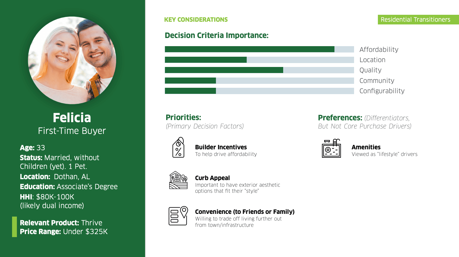
We developed 4 personas that the client recognized as familiar and representative of their customers.
02
Customer Journey Map
We conducted user interviews, surveys, and analyzed in-app analytics to understand the pain points and user needs. We also studied competitor apps and industry trends to gather insights
03
Feature Prioritization
We conducted user interviews, surveys, and analyzed in-app analytics to understand the pain points and user needs. We also studied competitor apps and industry trends to gather insights
04
User Flows
We conducted user interviews, surveys, and analyzed in-app analytics to understand the pain points and user needs. We also studied competitor apps and industry trends to gather insights
TRADeOFFS
Given the project’s timeline and backend constraints, we had to prioritize.
Some of the ideas that would have elevated personalization, like dynamically linking home features to specific floorplans or building out a full interior design inspiration hub, weren’t feasible with the data and infrastructure available. Instead, we focused on delivering a strong, scalable foundation that could support those enhancements later.
design | PHASE 3
Insight-Driven Designs
We defined key solutions that were completely new - not just for the Stone Martin website, but for the business as a whole, reimagining how the website could guide and enhance the end-to-end homebuying experience.

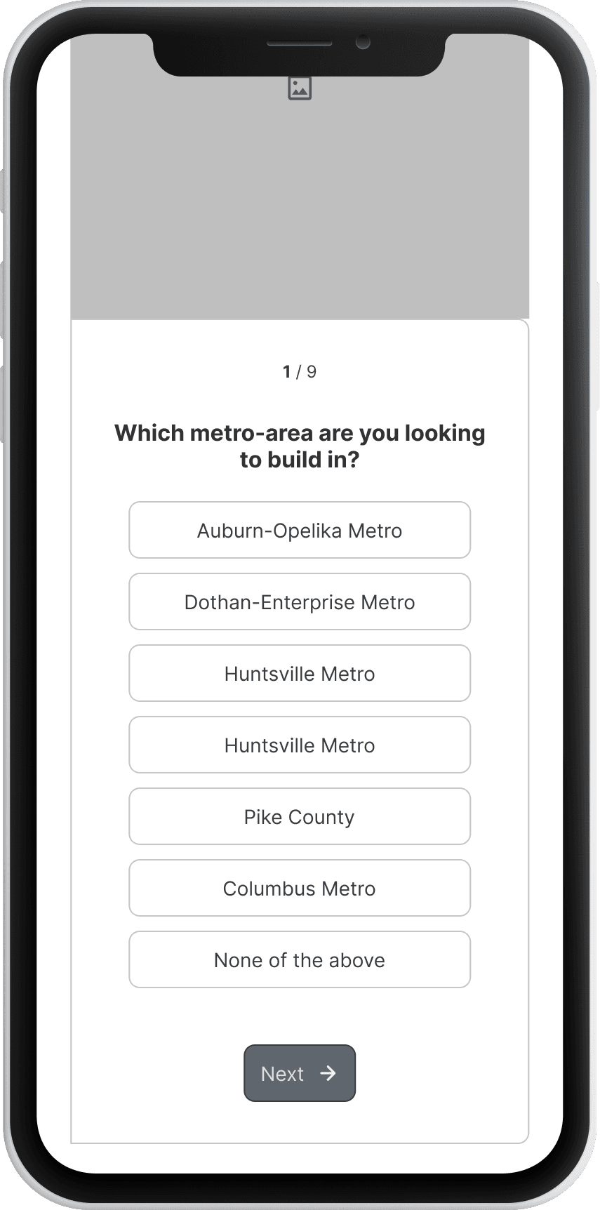
Find Your Home Search
Unified entry point where users can browse by community, floorplan, floorplan within a community, or quick-move-in home.
Flow by location → “I know where I want to live. Show me what’s available there.”
Flow by floorplan → “I love this floorplan. Show me where I can build it.”
Integrated communities
Combined Stone Martin and Thrive Homes under one experience to reduce brand confusion and allow users to shop seamlessly in a way that made sense to the user, not the business.

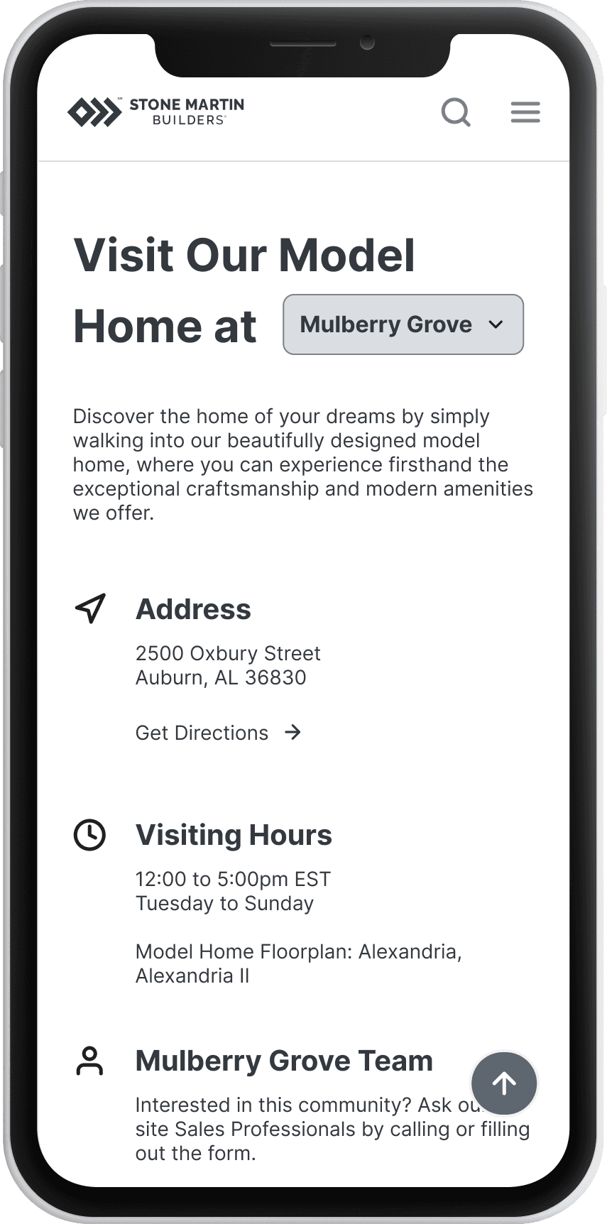
BOOK A TOUR Call-to-action
Allowed users to independently book a tour for the home of their dreams. This was a new function of Stone Martin Builders. Added site-wide to streamline conversions.

HOME FEATURES & PERSONALIZATION
Positioned personalization as a primary differentiator. The experience emphasizes how buyers can tailor floorplans and finishes, reinforcing the emotional and practical benefits of building from scratch.

LIFESTYLE QUIZ
Helps match users with homes that fit how they live, not just budget.
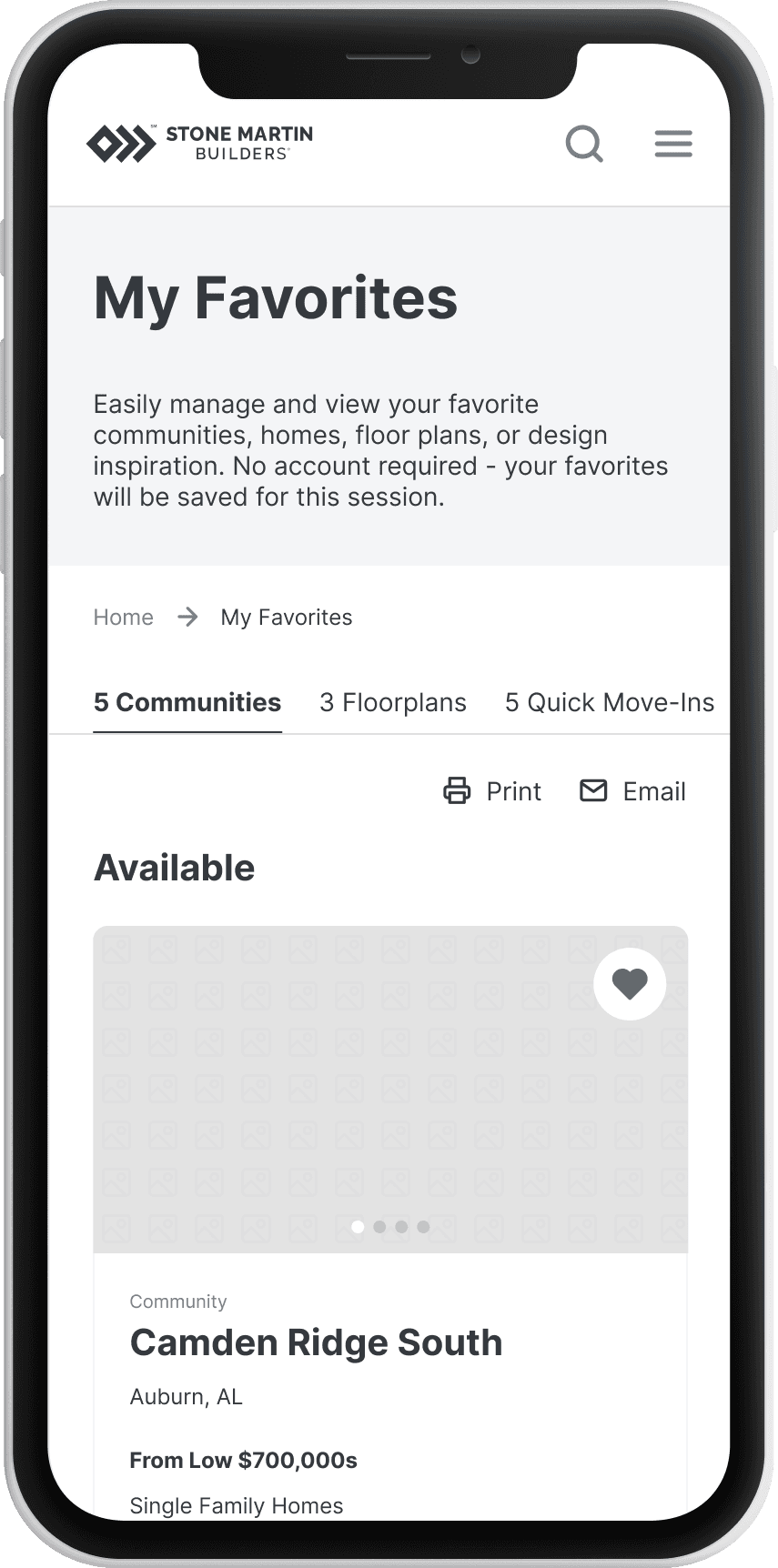
Favorites & Comparisons
Lightweight feature to compare homes and share interests with family, friends, and even Stone Martin sales staff.
Favorites & Comparisons
Lightweight feature to compare homes and share interests with family, friends, and even Stone Martin sales staff.

Find Your Home Search
Unified entry point where users can browse by community, floorplan, floorplan within a community [new to the website!], or quick-move-in home.
By location → “I know where I want to live. Show me what’s available there.”
By home design → “I love this floorplan. Show me where I can build it.”
Integrated communities
Combined Stone Martin and Thrive Homes under one experience to reduce brand confusion and allow users to shop seamlessly in a way that made sense to the user, not the business.
TESTING | PHASE 4
Validation Testing & Iteration
There were two moments in the re-design that we pressure tested our wireframes, post-wireframe stage (5 participants) and post-launch (15 participants).
These usability tests proved to poke holes in the content, user experience, and flow that helped elevate the website designs even further.
Pre-Launch Testing
Post-Launch Testing
What Worked
Users found the experience clean, intuitive, and easy to navigate.
Detail pages were appreciated for their clarity and comprehensiveness.
All necessary filters were present and accessible.
What Needed Improvement
Participants wanted move-in availability dates for quick move-ins to be clearly visible.
On mobile, users sometimes bypassed the sticky “Book a Tour” button on detail pages, suggesting the need for a scrolling placement as well.
WIREFRAME ITERATION: POST-USABILITY TESTING
Since we launch the brand new product 6 months ago, our product team is currently undergoing all necessary UX and engineering updates to mitigate all opportunities we discovered during testing.
Reflections & Learnings
Research Drives Clarity.
The most valuable decisions, about 80% of them, happened before any pixel was drawn.
Empathy Isn’t Just for Users, It’s For Stakeholders Too.
Balancing business needs with user needs builds long-term trust.
Engineering Collaboration is Critical.
Checking feasibility, through the feature prioritization matrix, early saved major rework later.
Reflections & Learnings
Research Drives Clarity.
The most valuable decisions, about 80% of them, happened before any pixel was drawn.
Empathy Isn’t Just for Users, It’s For Stakeholders Too.
Balancing business fears with user needs builds long-term trust.
Engineering Collaboration is Critical.
Checking feasibility, through the feature prioritization matrix, early saved major rework later.
Research & Insights
After 9 customer interviews, 10 stakeholder interviews, and 6 competitor audits, I synthesized insights into a set of key themes.
Users wanted a seamless navigation experience that helped them feel informed, inspired, and confident throughout the home-buying journey.
Stone Martin stakeholders needed the website to act as a discovery hub, transparent and informative, while encouraging human connection through booking a tour.
Users Needed
Simpler Navigation and Search (by location, lifestyle, or home type)
“Currently, the user really needs to know what community they're interested in to navigate the website. We need help building our website in a way that helps the buyer determine what neighborhood to move to.” —Stone Martin Builders Stakeholder, Sales Team
Clear Comparisons and Inspiration (i.e. Real Photos > Renderings)
“I would’ve loved if the website had design ideas, especially based on the floor plans and customization options.” –User
Human Connection; Ability to Talk to Someone Easily
"I want the ability to explore floorplans independently, but with a sales agent in easy reach to help answer any questions I may have." –User
Stakeholders Wanted
A Website That Looked as Premium as their Product, Without Over-Sharing Details
“We’re not a billion dollar company, we need our site to look like we are though. That innovation and brand impression is critical.” —Stone Martin Builders Stakeholder, CEO
Balance Between Online Transparency and Encouraging a Human Sales Conversation
“We want to give them enough information to pull them in; at the same time, lead them to a conversation with a sales person for further detail.” —Stone Martin Builders Stakeholder, Sales Team
WHAT SURPRISED ME
Stakeholders intentionally wanted to withhold some information to prompt personal follow-up, even though users asked for it. This tension became a core UX challenge; how to balance openness and restraint without losing trust.
DEFINE | PHASE 2
UX Strategy
Leveraging research insights, I conducted deep analysis and synthesis to identify the core elements to wireframe, ensuring every design decision was informed before sketching the first screen.
01
Personas
We developed 4 personas that the client recognized as familiar and representative of their customers.
02
Customer Journey Map
We conducted user interviews, surveys, and analyzed in-app analytics to understand the pain points and user needs. We also studied competitor apps and industry trends to gather insights
03
Feature Prioritization
We conducted user interviews, surveys, and analyzed in-app analytics to understand the pain points and user needs. We also studied competitor apps and industry trends to gather insights
04
User Flows
We conducted user interviews, surveys, and analyzed in-app analytics to understand the pain points and user needs. We also studied competitor apps and industry trends to gather insights
TRADOFFS
Given the project’s timeline and backend constraints, we had to prioritize.
Some of the ideas that would have elevated personalization, like dynamically linking home features to specific floorplans or building out a full interior design inspiration hub, weren’t feasible with the data and infrastructure available. Instead, we focused on delivering a strong, scalable foundation that could support those enhancements later.
design | PHASE 3
Solution-Oriented Wireframes
We defined key solutions that were completely new - not just for the Stone Martin website, but for the business as a whole, reimagining how the website could guide and enhance the end-to-end homebuying experience.
BOOK A TOUR Call-to-action
Allowed users to independently book a tour for the home of their dreams. This was a new function of Stone Martin Builders. Added site-wide to streamline conversions.
LIFESTYLE QUIZ
Helps match users with homes that fit how they live, not just budget.
HOME FEATURES & PERSONALIZATION
Positioned personalization as a primary differentiator. The experience emphasizes how buyers can tailor floorplans and finishes, reinforcing the emotional and practical benefits of building from scratch.
Find Your Home Search
Unified entry point where users can browse by community, floorplan, floorplan within a community [new to the website!], or quick-move-in home.
By location → “I know where I want to live. Show me what’s available there.”
By home design → “I love this floorplan. Show me where I can build it.”
Integrated communities
Combined Stone Martin and Thrive Homes under one experience to reduce brand confusion and allow users to shop seamlessly in a way that made sense to the user, not the business.
Favorites & Comparisons
Lightweight feature to compare homes and share interests with family, friends, and even Stone Martin sales staff.