

Friction to Flow: Usability Testing for Georgia Tech Housing
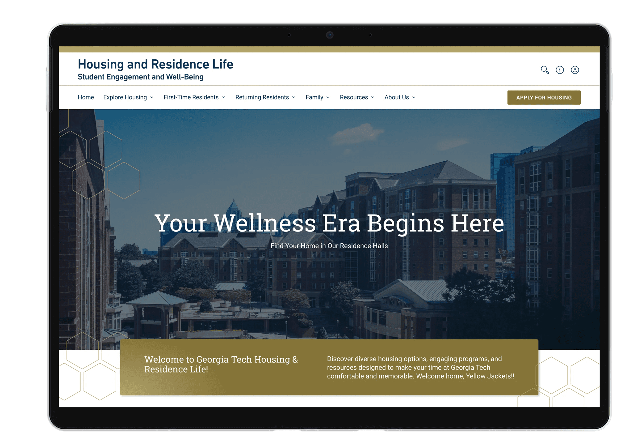
Following a comprehensive website redesign by the Nebo team, we needed to validate whether the new information architecture and visual language actually translated to a better user experience.
Following a comprehensive website redesign by the Nebo team, we needed to validate whether the new information architecture and visual language actually translated to a better user experience.
Following a comprehensive website redesign by the Nebo team, we needed to validate whether the new information architecture and visual language actually translated to a better user experience.


Project
Unmoderated Usability Testing
PARTICIPANTS
16 Unmoderated Sessions
Industry
Education
Users
Current Georgia Tech students and/or parents and prospective Georgia Tech students and/or parents
Role
Lead (& Sole) UX Researcher
TOOLS
Figma, FigJam, UserTesting.com, Google Analytics 4
Timeline
3 months (July 2025 - September 2025)
LIVE WEBSITE
The Challenge
Following a comprehensive website redesign by the Nebo team, we needed to validate whether the new information architecture (IA) and visual language actually translated to a better user experience.
The Goal
While the redesign was grounded in initial research, the "real world" test was missing: Can a stressed student or a busy parent actually find what they need in under two minutes?
The Outcome
90% of participants were able to complete all tasks successfully in the time allotted
Updates post usability test are projected to increase engagement by +50%
Research Strategy
Research Strategy
I designed an unmoderated study to stress-test the four pillars of the housing journey. I chose an unmoderated approach to capture authentic, "in-the-wild" behavior, allowing users to navigate the site on their own devices without the pressure of an observer.
Prospective Students
RESEARCH GOAL
Can they envision themselves here and understand how the housing system works?
USABILITY TEST TASKS
Explore dorm layouts, find the application deadline, and learn the roommate matching process.
Current Students
RESEARCH GOAL
Can they understand how to navigate the housing website to find specific information that’ll help them live more comfortably and confidently?
USABILITY TEST TASKS
File a maintenance request, manage current housing contracts, and find move-in resources.
Key Insights & Solutions
The data showed a site that was "visually stunning but occasionally vague." While the aesthetic was a clear win, the mental models of our users didn't always align with our new navigation.
Note: This is just a snapshot of all the insights. If you're interested in the full presentation, please don't hesitate to reach out to me!

VISUAL TRUST
Insight: 40% of users explicitly used the word "Modern." For prospective students, this wasn't just about looks, it signaled a high-quality living standard.
CLEARER MILESTONES
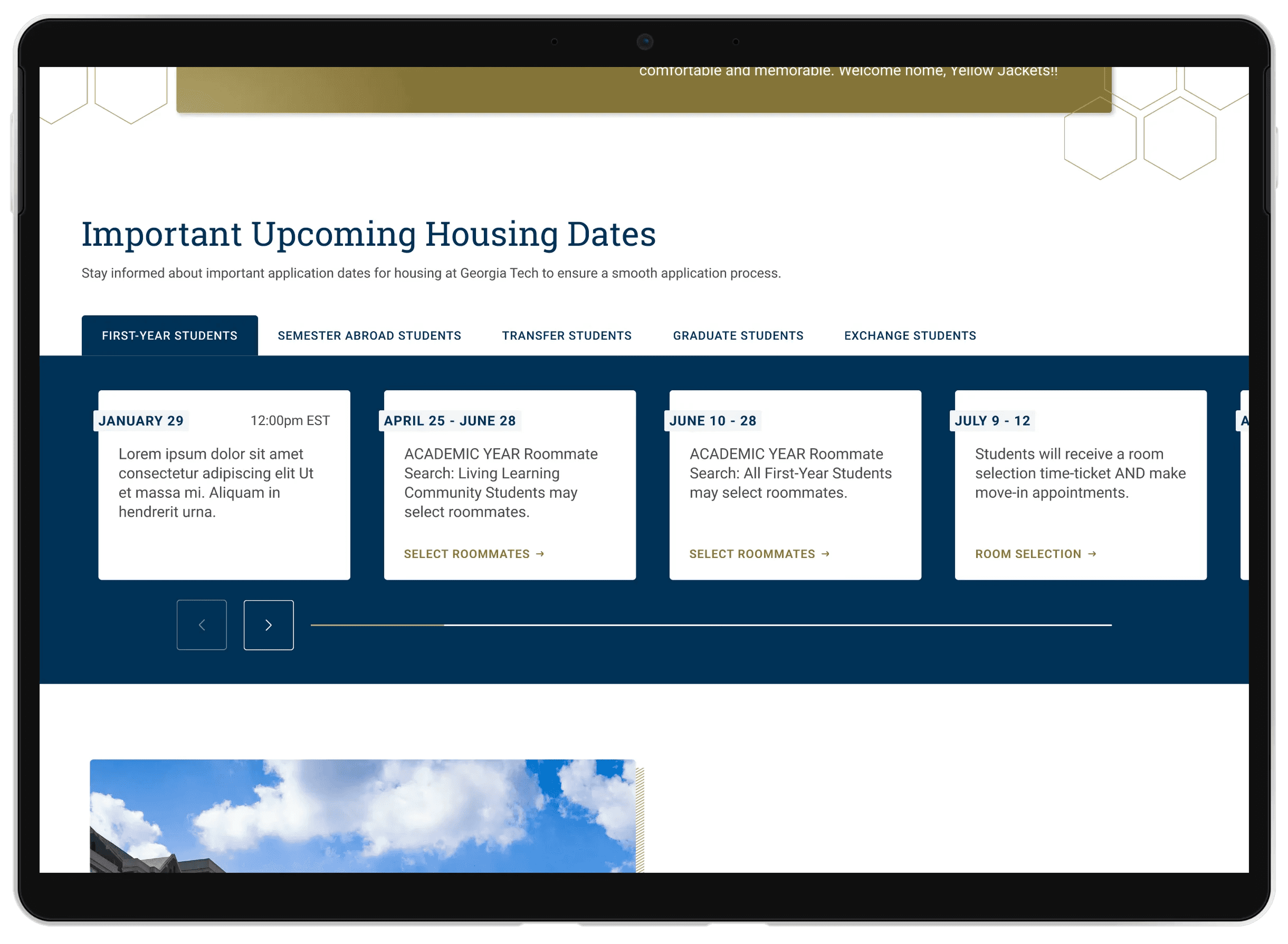
Insight: “The website feels incomplete. I felt like I needed a clearer overview of deadline and milestones.” —User
Solution: Rework the date display framework to present a complete timeline—clearly separating past events, upcoming dates, and scheduled email notifications.
CLARITY gap
Insight: While users loved the detailed dorm pages, 25% felt lost regarding the timeline of when to apply, when to expect deadlines to hit, etc.
Solution: Add a ‘New to Georgia Tech? Start Here’ section that explains the entire application process in plain language, with simple, easy-to-follow steps from start to finish
Reflections & Learnings
The Power of the Minority.
In a 16-person study, qualitative feedback isn't about statistical significance, it’s about ensuring all user experience issues are identified. For example, if 2 out of 16 people struggle to find the "Apply" button, a key user flow, that needs to be addressed.
The "Expert Blindness" Trap
As researchers, we get close to the wireframes. This study reminded me that what we think is "intuitive" is often just "familiarity."
Key Insights & Solutions
The data showed a site that was "visually stunning but occasionally vague." While the aesthetic was a clear win, the mental models of our users didn't always align with our new navigation.
VISUAL TRUST
Insight: 40% of users explicitly used the word "Modern." For prospective students, this wasn't just about looks, it signaled a high-quality living standard.

CLEARER MILESTONES
Insight: “The website feels incomplete. I felt like I needed a clearer overview of deadline and milestones.” —User
Solution: Rework the date display framework to present a complete timeline—clearly separating past events, upcoming dates, and scheduled email notifications.

CLARITY gap
Insight: While users loved the detailed dorm pages, 25% felt lost regarding the timeline of when to apply, when to expect deadlines to hit, etc.
Solution: Add a ‘New to Georgia Tech? Start Here’ section that explains the entire application process in plain language, with simple, easy-to-follow steps from start to finish
Key Insights & Solutions
The data showed a site that was "visually stunning but occasionally vague." While the aesthetic was a clear win, the mental models of our users didn't always align with our new navigation.

VISUAL TRUST
Insight: 40% of users explicitly used the word "Modern." For prospective students, this wasn't just about looks, it signaled a high-quality living standard.

CLEARER MILESTONES
Insight: “The website feels incomplete. I felt like I needed a clearer overview of deadline and milestones.” —User
Solution: Rework the date display framework to present a complete timeline—clearly separating past events, upcoming dates, and scheduled email notifications.
CLARITY gap
Insight: While users loved the detailed dorm pages, 25% felt lost regarding the timeline of when to apply, when to expect deadlines to hit, etc.
Solution: Add a ‘New to Georgia Tech? Start Here’ section that explains the entire application process in plain language, with simple, easy-to-follow steps from start to finish
Reflections & Learnings
The Power of the Minority.
In a 16-person study, qualitative feedback isn't about statistical significance, it’s about ensuring all user experience issues are identified. For example, if 2 out of 16 people struggle to find the "Apply" button, a key user flow, that needs to be addressed.
The "Expert Blindness" Trap
As researchers, we get close to the wireframes. This study reminded me that what we think is "intuitive" is often just "familiarity."
Project
Unmoderated Usability Testing
PARTICIPANTS
16 Unmoderated Sessions
Industry
Education
Users
Current Georgia Tech students and/or parents and prospective Georgia Tech students and/or parents
Role
Lead (& Sole) UX Researcher
Timeline
3 months (July 2025 - September 2025)
LIVE WEBSITE
The Challenge
Following a comprehensive website redesign by the Nebo team, we needed to validate whether the new information architecture (IA) and visual language actually translated to a better user experience.
The Goal
While the redesign was grounded in initial research, the "real world" test was missing: Can a stressed student or a busy parent actually find what they need in under two minutes?
The Outcome
90% of participants were able to complete all tasks successfully in the time allotted.