

Ships Page Redesign: Driving Clarity and Conversions
Design a digital experience that communicated the elegance, legacy, and unique value of ACL ships, while guiding users seamlessly toward exploration and booking.
Design a digital experience that communicated the elegance, legacy, and unique value of ACL ships, while guiding users seamlessly toward exploration and booking.
Design a digital experience that communicated the elegance, legacy, and unique value of ACL ships, while guiding users seamlessly toward exploration and booking.


Project
Project
User Experience Optimization - User Flow Re-Design
User Experience Optimization - User Flow Re-Design
Industry
Industry
Cruiseline
Cruiseline
Users
Users
Affluent travelers aged 65+, many of whom prioritize comfort, accessibility, and safety
Affluent travelers aged 65+, many of whom prioritize comfort, accessibility, and safety
Role
Role
Lead (& Sole) UX Researcher and UX Designer
Lead (& Sole) UX Researcher and UX Designer
TOOLS
TOOLS
Figma, FigJam, Lucky Orange
Figma, FigJam, Lucky Orange
Timeline
Timeline
6 months (March 2025 - August 2025)
6 months (March 2025 - August 2025)
LIVE WEBSITE
LIVE WEBSITE
The Challenge
ACL’s ships are meticulously crafted, and the company takes immense pride in that legacy, but their digital presence regarding their ships wasn’t reflecting it. The “View All Ships” and “Class of Ships” pages felt outdated, text-heavy, and inconsistent, leaving users unsure which ship suited their travel plans.
The Goal
My goal was to create a digital experience that communicated the elegance, legacy, and unique value of ACL ships, while guiding users seamlessly toward exploration and booking.
The Outcome
Users can now navigate ships by region, compare options clearly, and understand unique benefits.
Increased engagement by +70% and trust through richer content, visual storytelling, and better conversion paths.
Reinforced American Cruise Line's premium brand online, aligning digital experience with pride in craftsmanship.
Challenge
ACL’s ships are meticulously crafted, and the company takes immense pride in that legacy, but their digital presence regarding their ships wasn’t reflecting it. The “View All Ships” and “Class of Ships” pages felt outdated, text-heavy, and inconsistent, leaving users unsure which ship suited their travel plans.
Goal
My goal was to create a digital experience that communicated the elegance, legacy, and unique value of ACL ships—while guiding users seamlessly toward exploration and booking.
Outcome
Users can now navigate ships by region, compare options clearly, and understand unique benefits.
Increased engagement and trust through richer content, visual storytelling, and better conversion paths.
Reinforced American Cruise Line's premium brand online, aligning digital experience with pride in craftsmanship.
Key Challenges & Opportunities
Key Challenges & Opportunities
Problem 1
Confusing Organization
Ship classes didn’t resonate with users; most skipped these pages entirely. Users were trying to make decisions based on region and schedule, not ship class.
SOLUTION 1
Re-Organize Architecture
Organize the ships by region and/or location they sail in instead of ship class, so they resonate with users much more.
Problem 2
Lack of Engagement
Heavy text and limited visuals made it hard for users to differentiate ships.
SOLUTION 2
Showcase Differentiated Value
Lean into luxury and elegant imagery for these ships that can help users quickly understand value for each differentiated ship.
Problem 3
Low Conversion
CTAs were buried or unclear, leading to drop-offs. ~1 in 6 users exited from the “View All Ships” page without any conversion.
SOLUTION 3
Seamlessly Drive Users to Funnel
When exploring the region ship pages, users should be driven into the funnel in a seamless way that makes sense to their journey.
Problem 4
Missed Storytelling Opportunity
ACL’s craftsmanship and premium positioning weren’t reflected on broader pages.
SOLUTION 4
Lean Into Luxury & Premium Content
The primary customer of ACL cares deeply about a premium experience, so by leaning into this story the likelihood of conversions increasing are higher.
DISCOVER | PHASE 1
Research & Insights
Despite a limited research budget, I recommended carving out time for a focused research and UX strategy phase to align on a clear approach before moving into wireframes.
During this phase, I conducted stakeholder interviews, led a competitive analysis, mapped the end-to-end user flow for exploring ships, and facilitated iterative design workshops to align on goals and strategic direction.
Users Needed
Stakeholders Wanted
Region-Led Discovery v. Ship-Led Discovery
Users primarily begin their journey through regional entry points, with destination driving exploration more than ship class.
High Loyalty, High Expectation
With ~40% of users returning, repeat visitors need faster access to relevant ships and content—prioritizing clarity for the user.
Accessibility & Simplicity
American Cruise Line's older audience requires a highly accessible, low-complexity experience.
TRADEOFFs
For an older audience, flashy interactions or complex features would have hindered usability. I focused on a linear, intuitive experience that reinforced ACL’s brand without overwhelming users or dev resources.


DEFINE & design | PHASE 2 & 3
Insight-Driven Wireframes
By doing the research and strategy, we were able to thoroughly convince the client to adjust the entire structure of the ships pages on the website, which led to a more user-friendly and seamless flow. This wasn’t something that happened easily, it happened with research-backed insights that inspired the client to move in a direction that was best for the user.
CONTENT & STORYTELLING: SHIP REGION
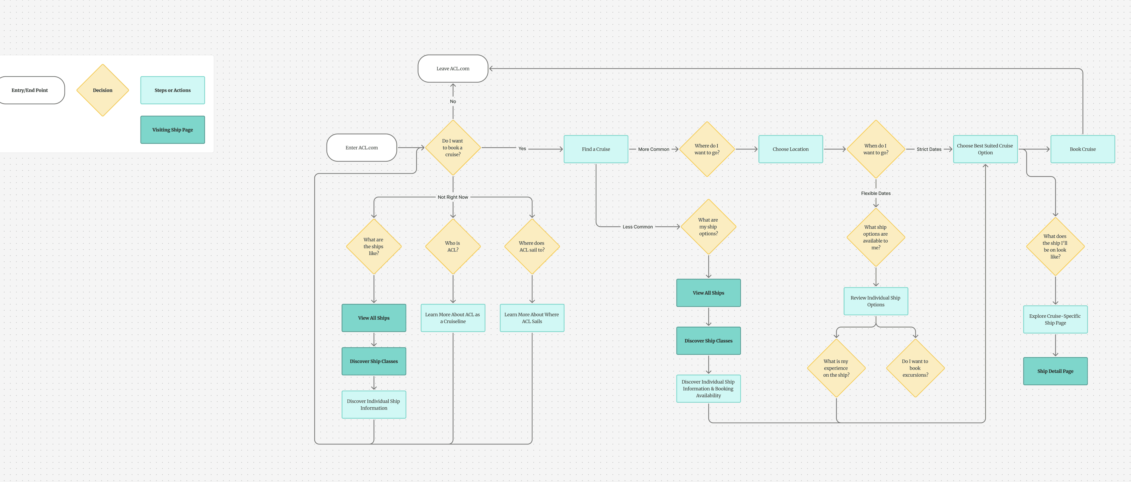
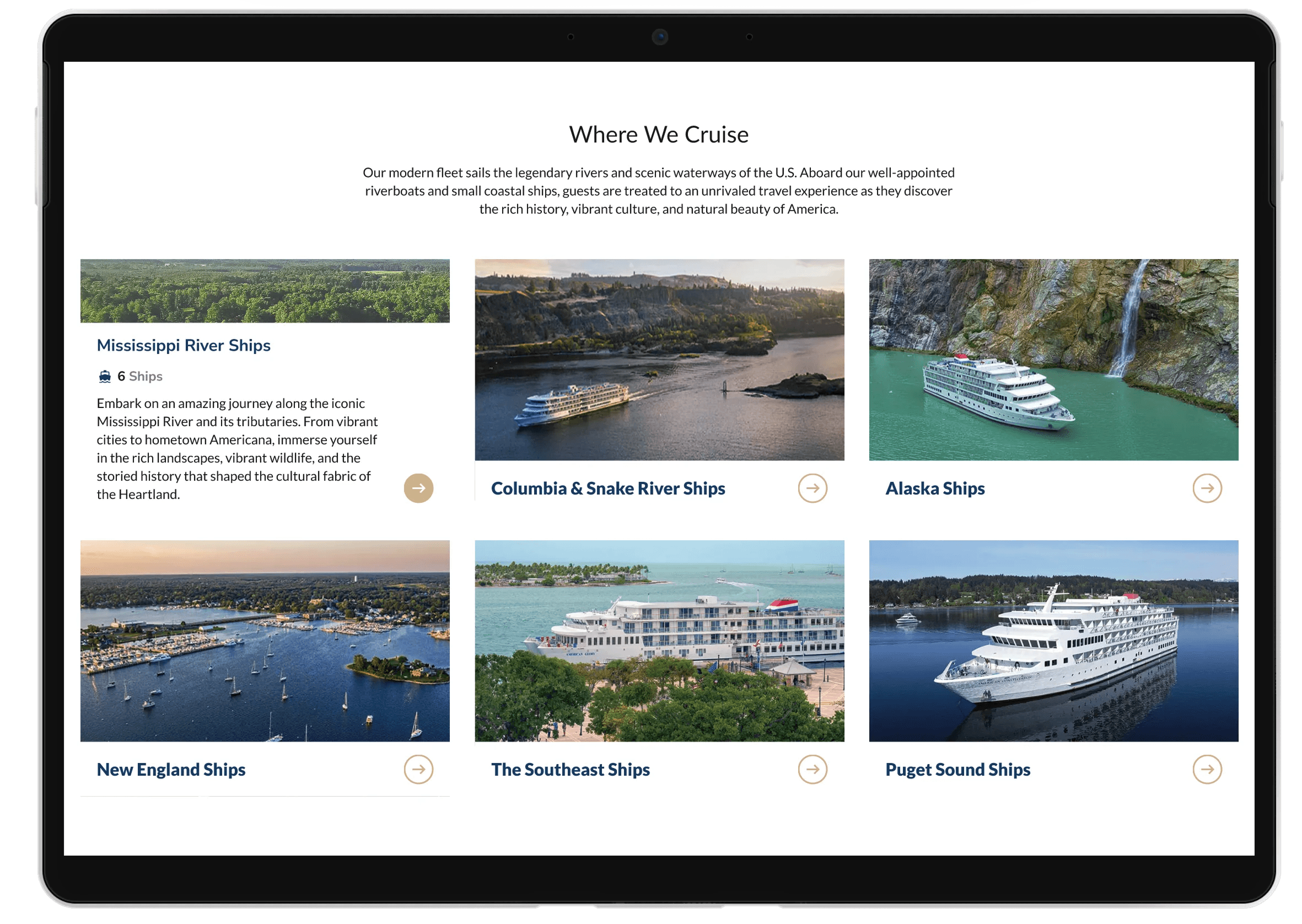
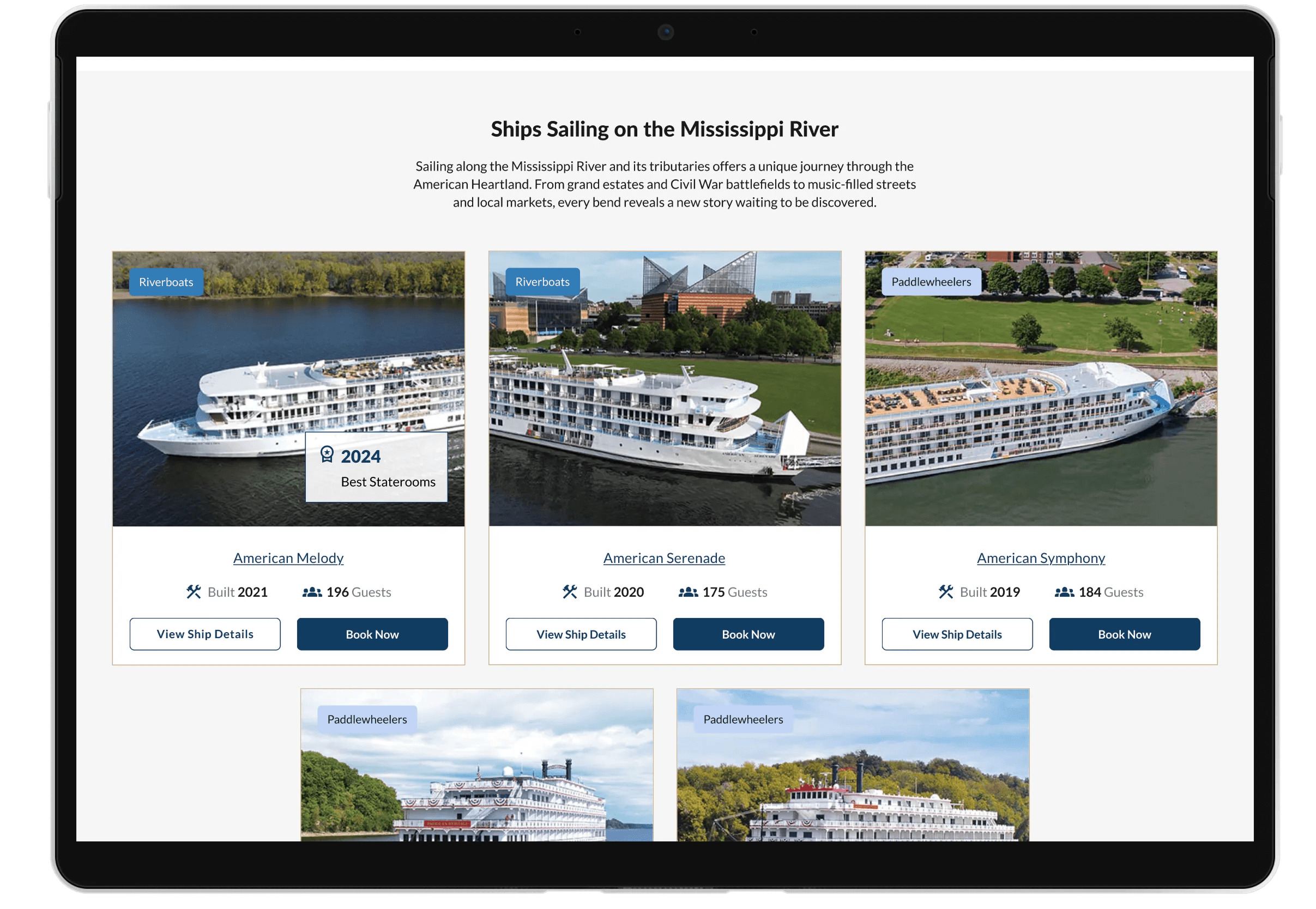
It became clear that we should move away from the Class of Ship pages completely and focus on creating Ship Region pages. Regional organization better aligns with how users think and search.
Users now move from View All Ships → Ship Region → Individual Ship → Booking/Inquiry.
CONTENT & STORYTELLING: clarity
Simplified educational content explaining key differences between river and coastal cruises, passenger capacity, ship age, and seasonal considerations.
Contextual, action-driven CTAs that guide users naturally—Get a Brochure, Find a Cruise, and Book Now.

CONTENT & STORYTELLING: VIRTUAL TOURS
Because virtual tours are a key part of the exploration process, this page highlights 360° ship tours to help users quickly and confidently explore each ship.
CONVERSION & TRUST: TRANSPARENCY
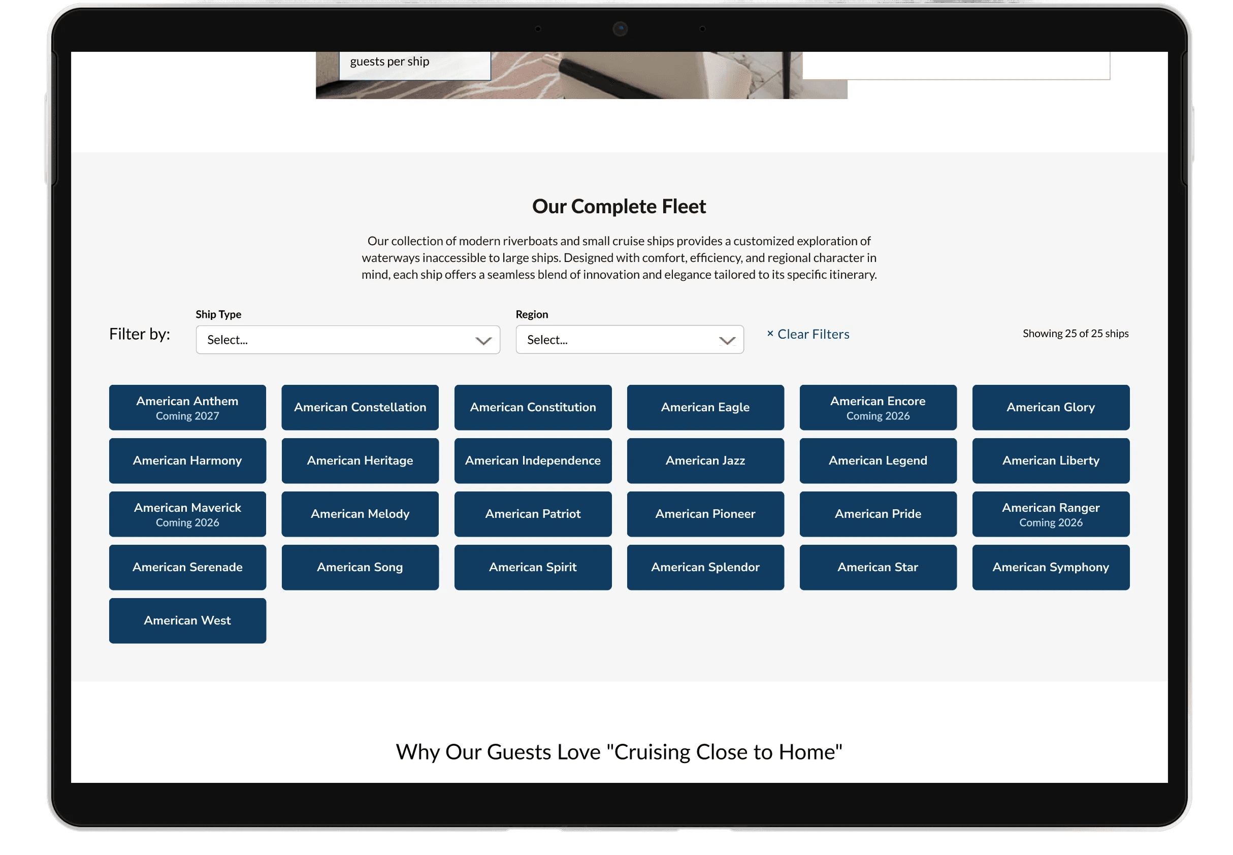
An intuitive filtering system lets users easily explore the full American Cruise Line fleet, seeing where each ship sails and its ship type, supporting personal preferences and confident decision-making.
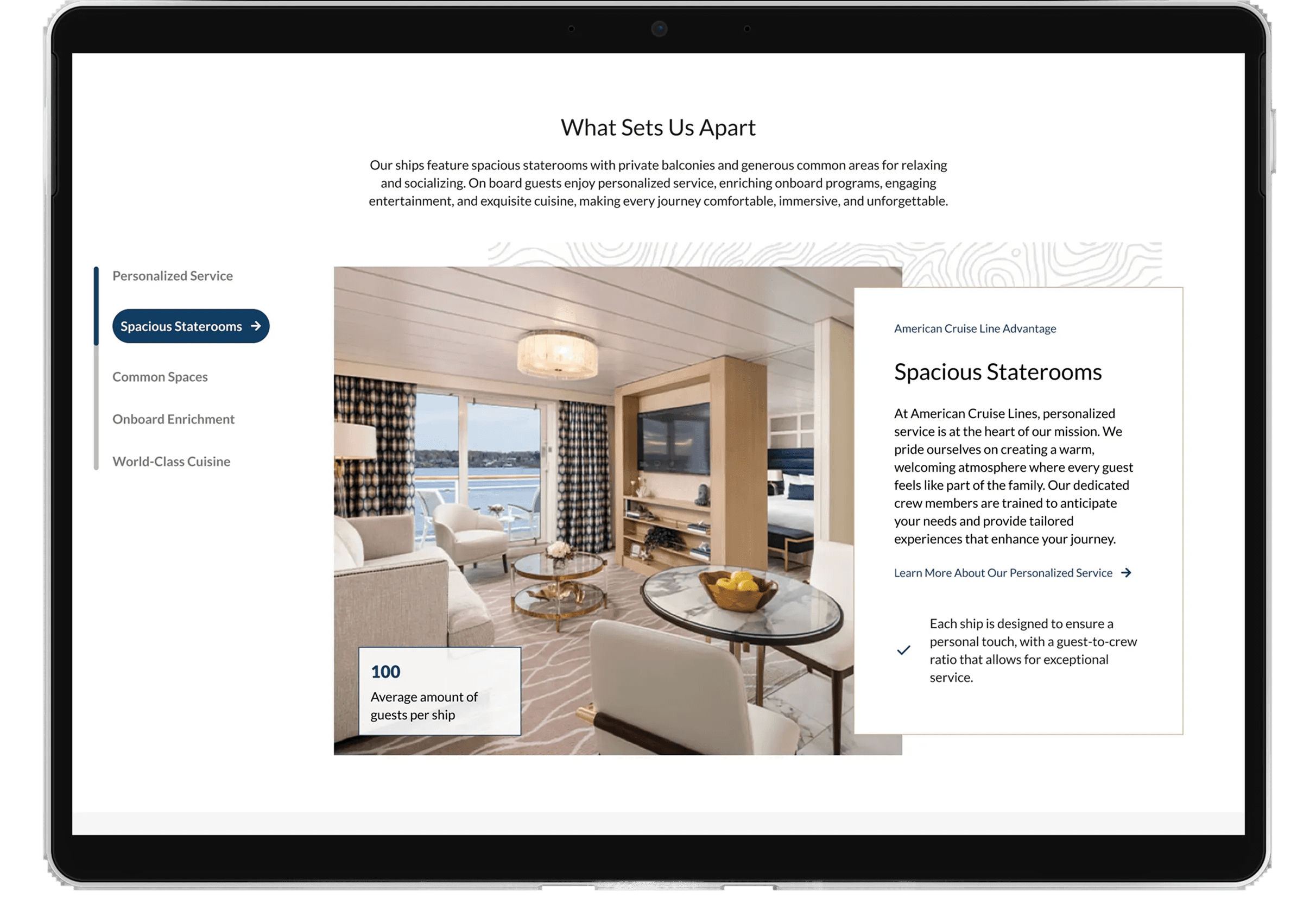
CONTENT & STORYTELLING: RICH IMAGERY
High-quality imagery gives users a realistic sense of the onboard experience, reducing uncertainty during exploration.

CONVERSION & TRUST: Reviews & ACCESSIBILITY
Credibility signals like curated Trustpilot reviews, awards, and satisfaction stats build trust with users.
Clear accessibility benefits of smaller ships—easy shore access, on-board medical support, comfort, and mobility-friendly design.
Reflections & Learnings
Reflections & Learnings
Scrappy research can be strategic.
Even with limited budget, targeted interviews and audits provided high-impact insights.
Simplicity is powerful.
Designing for an older audience reinforced the importance of clear, linear paths and avoiding unnecessary complexity.
Storytelling sells and is a key part of UX work.
Highlighting craftsmanship, history, and comfort can convert users while staying true to the brand.
DEFINE & design | PHASE 2 & 3
Insight-Driven Wireframes
By doing the research and strategy, we were able to thoroughly convince the client to adjust the entire structure of the ships pages on the website, which led to a more user-friendly and seamless flow. This wasn’t something that happened easily, it happened with research-backed insights that inspired the client to move in a direction that was best for the user.
CONTENT & STORYTELLING: SHIP REGION
It became clear that we should move away from the Class of Ship pages completely and focus on creating Ship Region pages. Regional organization better aligns with how users think and search.
Users now move from View All Ships → Ship Region → Individual Ship → Booking/Inquiry.
CONTENT & STORYTELLING: clarity
Simplified educational content explaining key differences between river and coastal cruises, passenger capacity, ship age, and seasonal considerations.
Contextual, action-driven CTAs that guide users naturally—Get a Brochure, Find a Cruise, and Book Now.
CONTENT & STORYTELLING: VIRTUAL TOURS
Because virtual tours are a key part of the exploration process, this page highlights 360° ship tours to help users quickly and confidently explore each ship.
CONVERSION & TRUST: TRANSPARENCY
An intuitive filtering system lets users easily explore the full American Cruise Line fleet, seeing where each ship sails and its ship type, supporting personal preferences and confident decision-making.
CONTENT & STORYTELLING: RICH IMAGERY
High-quality imagery gives users a realistic sense of the onboard experience, reducing uncertainty during exploration.
CONVERSION & TRUST: Reviews & ACCESSIBILITY
Credibility signals like curated Trustpilot reviews, awards, and satisfaction stats build trust with users.
Clear accessibility benefits of smaller ships—easy shore access, on-board medical support, comfort, and mobility-friendly design.
Research & Insights
Despite a limited research budget, I recommended carving out time for a focused research and UX strategy phase to align on a clear approach before moving into wireframes.
During this phase, I conducted stakeholder interviews, led a competitive analysis, mapped the end-to-end user flow for exploring ships, and facilitated iterative design workshops to align on goals and strategic direction.
Users Needed
Region-Led Discovery v. Ship-Led Discovery
Users primarily begin their journey through regional entry points, with destination driving exploration more than ship class.
High Loyalty, High Expectation
With ~40% of users returning, repeat visitors need faster access to relevant ships and content—prioritizing clarity for the user.
Accessibility & Simplicity
American Cruise Line's older audience requires a highly accessible, low-complexity experience.
Stakeholders Wanted
Craftsmanship and Brand Story Not Clear
While ACL stakeholders value ship craftsmanship and brand story, users struggle to see or understand this value online.
Familiarity Matters for Users, Simple for Engineers
Users benefit from meaningful UX improvements that enhance usability without straying too far from ACL’s established look and feel.
TRADEOFFS
For an older audience, flashy interactions or complex features would have hindered usability. I focused on a linear, intuitive experience that reinforced ACL’s brand without overwhelming users or dev resources.